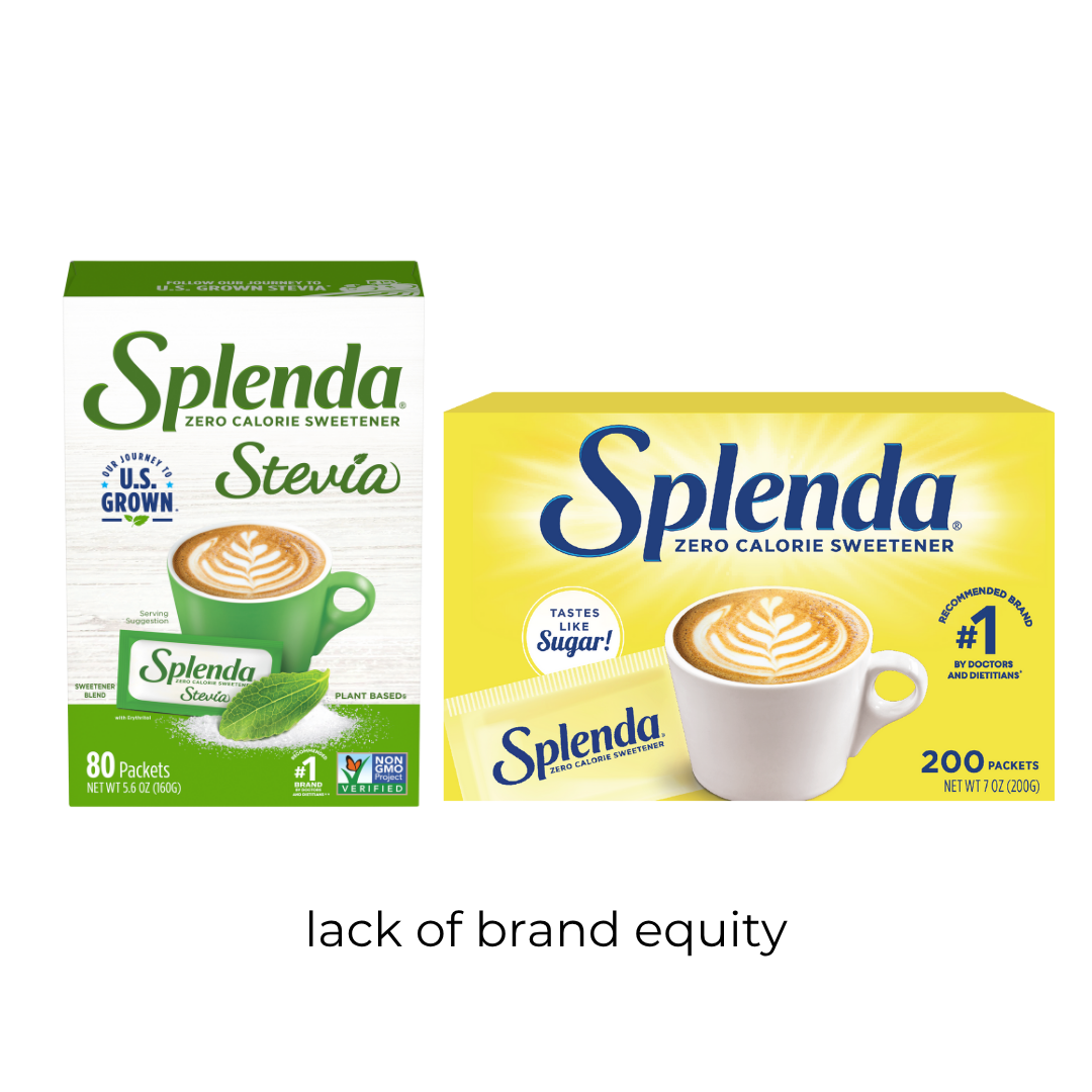


The Splenda stevia packaging was in need of a relaunch as the ingredients were changing to include fully U.S. grown stevia. We wanted to look at a couple things as we launched this exploration:
How do we compare to the other stevias on the shelf?
How do we compare to ourselves on the shelf?
What do consumers care about?
Research showed we could go in two ways, we could lean hard into the natural space and use the cues others (and what we currently were using) to signal natural. Or we could lean on the brand equity that was already built and lean into the signature bold color and simple style to stand out against the competition.
We found two big problems with our current: